We’ve faced this problem a few times, as we roll out a distributed application across a network of remote locations. A fairly typical challenge is to explain the impact of a technical architecture improvement in a relevant, meaningful way – without resorting to techno-jargon.
A good approach includes:
- Keep it short – Too much detail and you will lose them. Find the balance between enough information to be valuable, but not so much as to be boring
- Focus on the Relevant – Don’t worry about deep and/or academic observations; make your point relevant to their current priorities
- Metrics – quantifiable measurements of Before and After a system change. You might also try to throw in something to indicate an acceptable target metric – even though you’ve changed the system, is it good enough yet?
- Facts vs. Opinions – back up the metrics with hard facts, and try not to fall back on anecdotal evidence
- Know your Audience – eliminate the jargon, but try to provide enough technical detail to keep the techies from second guessing
I like to create communication pieces that are fully “self-contained” – they include enough definitions, background facts, level-setting devices, etc. that a reasonably intelligent person should be able to read and understand without requiring heavy Q&A.
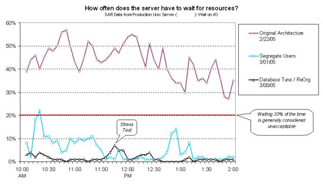
A recent example: A single-server UNIX environment that was supporting application, database, and SSH users was straining under the load. Our project added a middle tier of Linux servers to handle the SSH sessions, freeing our monstrous server to focus on the database. As a second step, we re-organized the database and tuned the memory settings.

- We used SAR data to track wait time on resources, and took snapshots before and after the changes. The important metric is the relative difference in wait time, so we went to great pains to phrase things clearly and in a non-technical way.
- Note that the subtitle gets technical – that’s just to give the Unix-aware a touchpoint that they could relate to.
- We also added the 20% line to show that not only had we made a large relative improvement, but we were well under acceptable levels (ie. we were successful and we were done)
- We knew the selected batch reports were causing problems, so we made a point to use them for our “stress test”. Although the business community may not fully understand the “stress test” concept, they all know how long Aging reports used to run!


This Post Has 0 Comments